

Brand identity for The William Morris Society, to coincide with their 50th anniversary.
Set up in 1955, the society’s goal is to preserve Morris’s memory by introducing his ideas on creative work, leisure, conservation and politics to new generations.
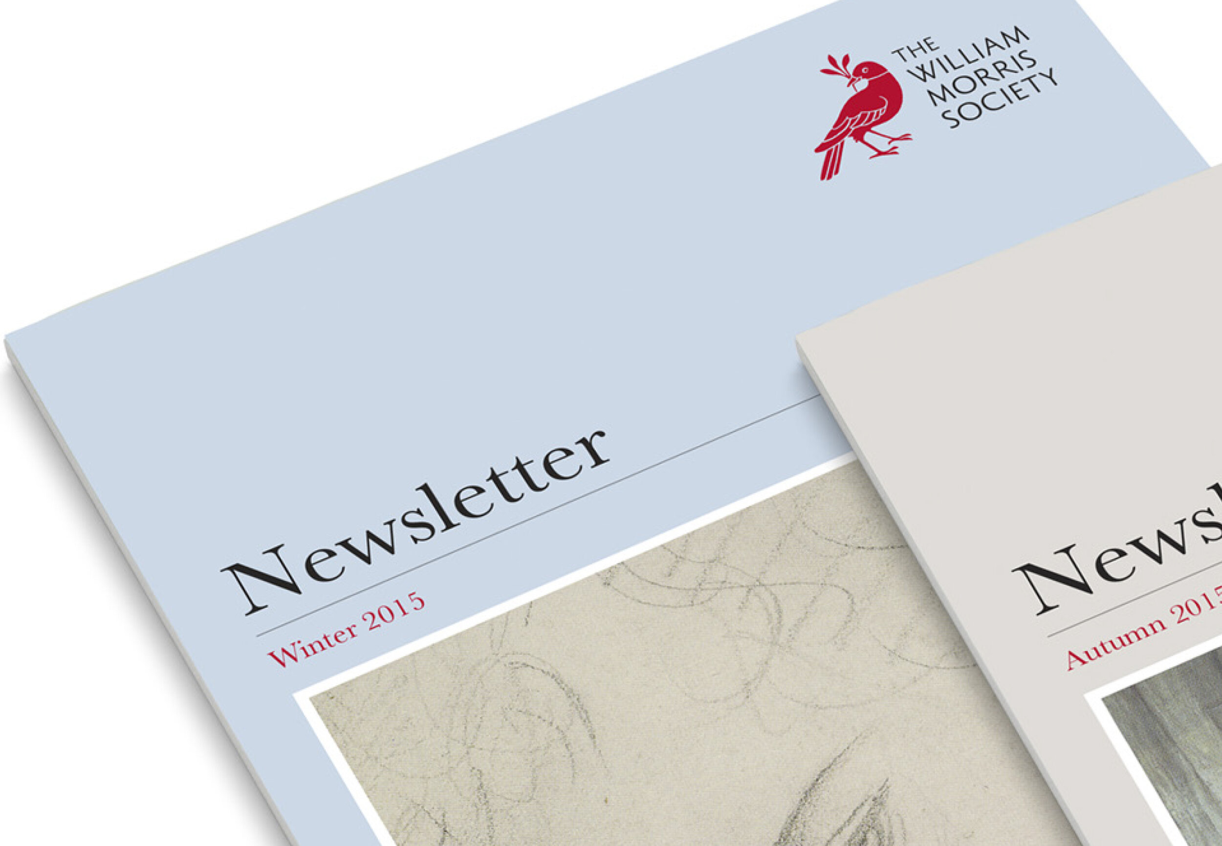
The society's previous output was inconsistent and included four separate logos with eleven variations. The new identity unifies the society’s communications, under a new emblem and name lockup.
The emblem is hand-drawn and derived from Morris’s Bird print, which is owned by the society. Evoking the visual language of the publisher’s colophon, the bird also serves as an expression of Morris’s artistic and literary sensibility.
The primary colour palette is inspired by his illuminated manuscripts and complimented by secondary colours derived from his 'Jasmine' print, which is also part of the society’s archive.


2015 | THE WILLIAM MORRIS SOCIETY
Brand Identity and Guidelines
AGENCY: PENTAGRAM (Partner: Angus Hyland)
Images: Pentagram / CWR