

Brand identity for London-based fine greeting card company.
J+A London produce finely crafted greeting cards that pair graphic patterns with the sculptural, expressive potential of paper.
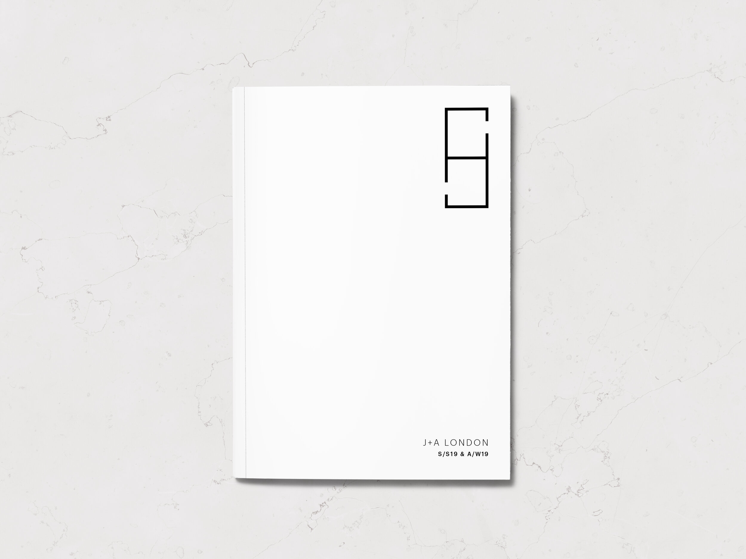
The identity centres on an ambigram. Based firmly in the grid language that underpins the collections, the logo is an abstracted form of the initials ‘J’ and ‘A’, whilst the rotatable nature of the mark denotes the equal creative partnership of the founders.
This is complimented by a minimal word mark and typography, with a monochromatic primary colour palette that allows the subtle colours and textures of the products to shine.


2019 | J+A London
Brand Identity, Website Concept, Print Collateral